2022- 2023
Vampr Web
Vampr is the #1 networking App for musicians, where you can find other artists to collaborate with, create new music and monetize your work.
Team
2 Product Managers
Product designer (Me)
CTO & Engineering team
Role
👨🏻💻 Lead Product Design
🧐 Design QA
Challenge
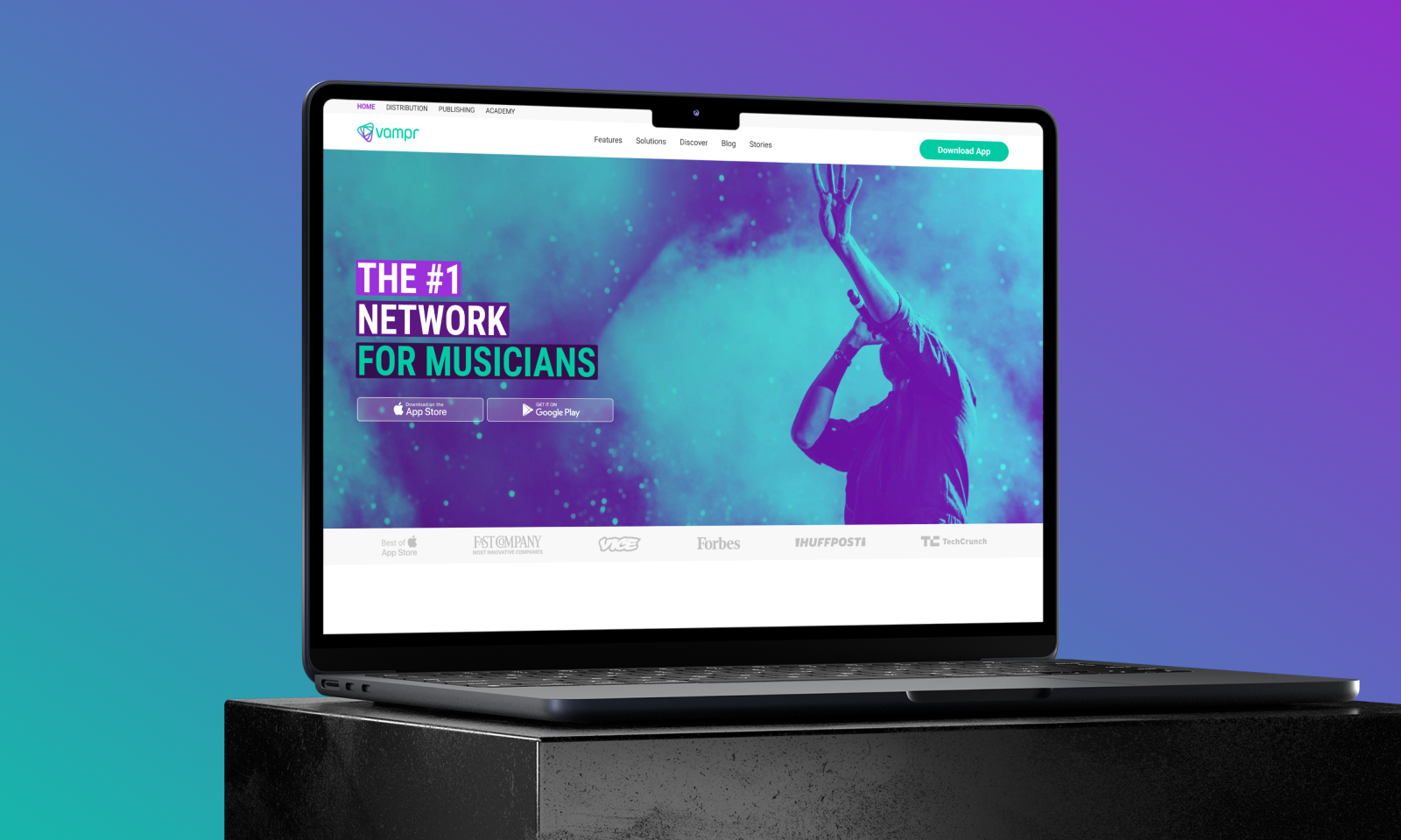
Vampr offers a total of four awesome products: a Networking App, Distribution, Publishing, Academy, and Marketing. When I first joined the team, our web presence left a lot to be desired. We had just one landing page, but it wasn’t converting so well because of design issues and copyright concerns.
My mission was to give our web experience a complete makeover by crafting responsive landing pages for each of Vampr’s products.
It was a challenge because Vampr didn’t have a set web design system in place at the time. So, I tackled this task while also juggling other responsibilities, gradually building a design system for both the app and website.
Goal
→ Establish the website as a trusted source.
→ Boost organic traffic.
→ Increase user growth.
→ Implement a sleek design to stay current with UI trends.

Early Stage
In the initial stages, I identified a critical UX bottleneck affecting site navigation. To address this, I spearheaded ideation sessions with our Project Managers (Jessy & German) and CTO (Chris), employing methodologies like Design Thinking and Heuristic Evaluation.
I then moved on to the prototyping phase, utilizing Figma to create Mid-fidelity mockups. These prototypes underwent A/B testing and heuristic evaluations with cross-functional team members who were not directly involved in the design process. Their feedback was instrumental in the iterative design cycle, allowing for data-driven refinements.
Simultaneously, I was managing my time to accommodate another high-priority project, Vampr Academy. This involved close collaboration with German, and the application of Agile methodologies to ensure both projects progressed in parallel without compromising quality.

Setting Design Foundation
After successfully mitigating the UX bottlenecks in the navigation flow, I pivoted to the wireframing phase for the main landing page. Utilizing design systems and UI components, my objective was to create a scalable and cohesive design architecture. This would serve as the cornerstone style guide for landing pages across our diverse product portfolio. By doing so, I aimed to ensure brand consistency, enhance user engagement, and facilitate easier design updates in the future.

Designing Vampr products
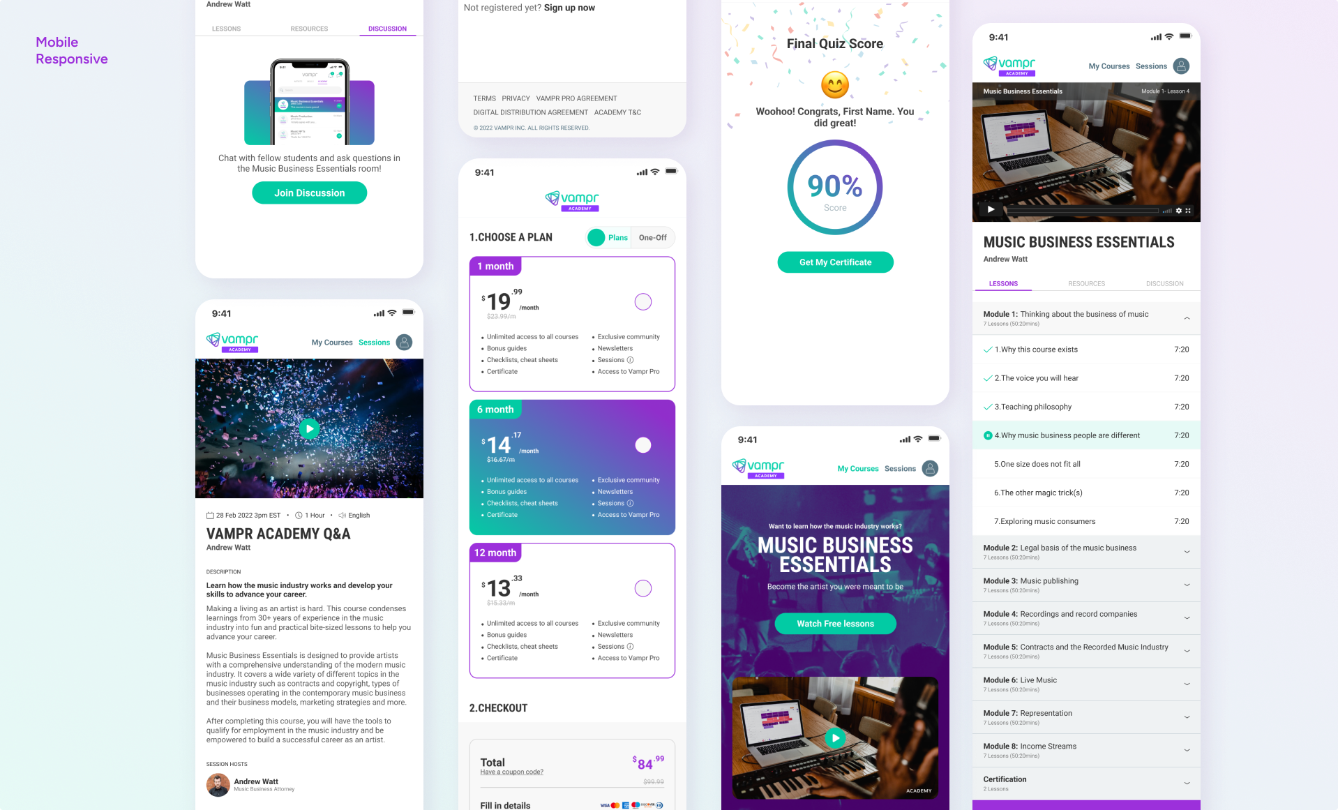
For the additional landing pages—covering Distribution, Publishing, Academy, and Marketing—I diligently adhered to the design framework established by the primary homepage. This was to ensure brand consistency, streamline the user experience, and facilitate easier future updates across all product verticals.
“Internal usability testing to meet business deadline”
Vampr Academy
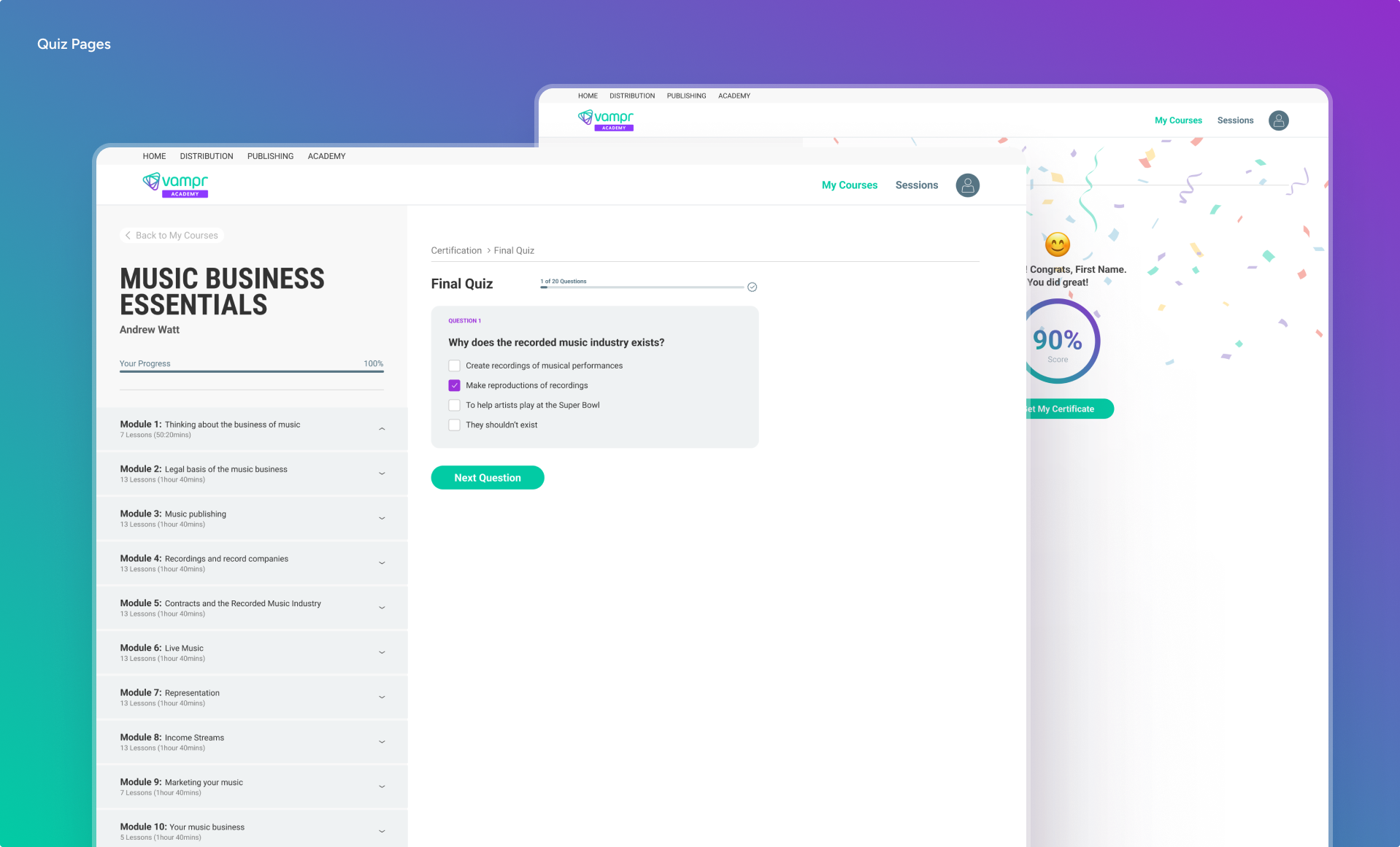
My first project at Vampr was Academy end-end. When I joined Vampr, we had a two-month timeline to complete the entire web platform and add it as a new feature to the Vampr App.
Before I started on Academy, the team had already researched the concept and believed it could boost our revenue. To ensure I understood how music education worked within the industry, I did my homework on this new feature’s background before diving into the design phase.
This research greatly influenced my design approach, and I collaborated closely with our Product Manager, German, throughout the project’s development. We brainstormed ideas together for many sections of Academy.
Agile Usability Testing
Operating under a constrained timeline, we instituted a robust weekly cadence of internal usability tests. This approach was particularly crucial when we faced decision points featuring two equally viable design options for specific functionalities. By employing these usability tests, we were able to gather actionable insights into user behavior and preferences. This empirical data enabled us to make data-driven decisions that not only met but often exceeded our user experience and usability benchmarks. The frequent testing also allowed for rapid iterations, ensuring that we stayed agile and responsive to user needs while maintaining the project’s momentum.


Design Hand-off
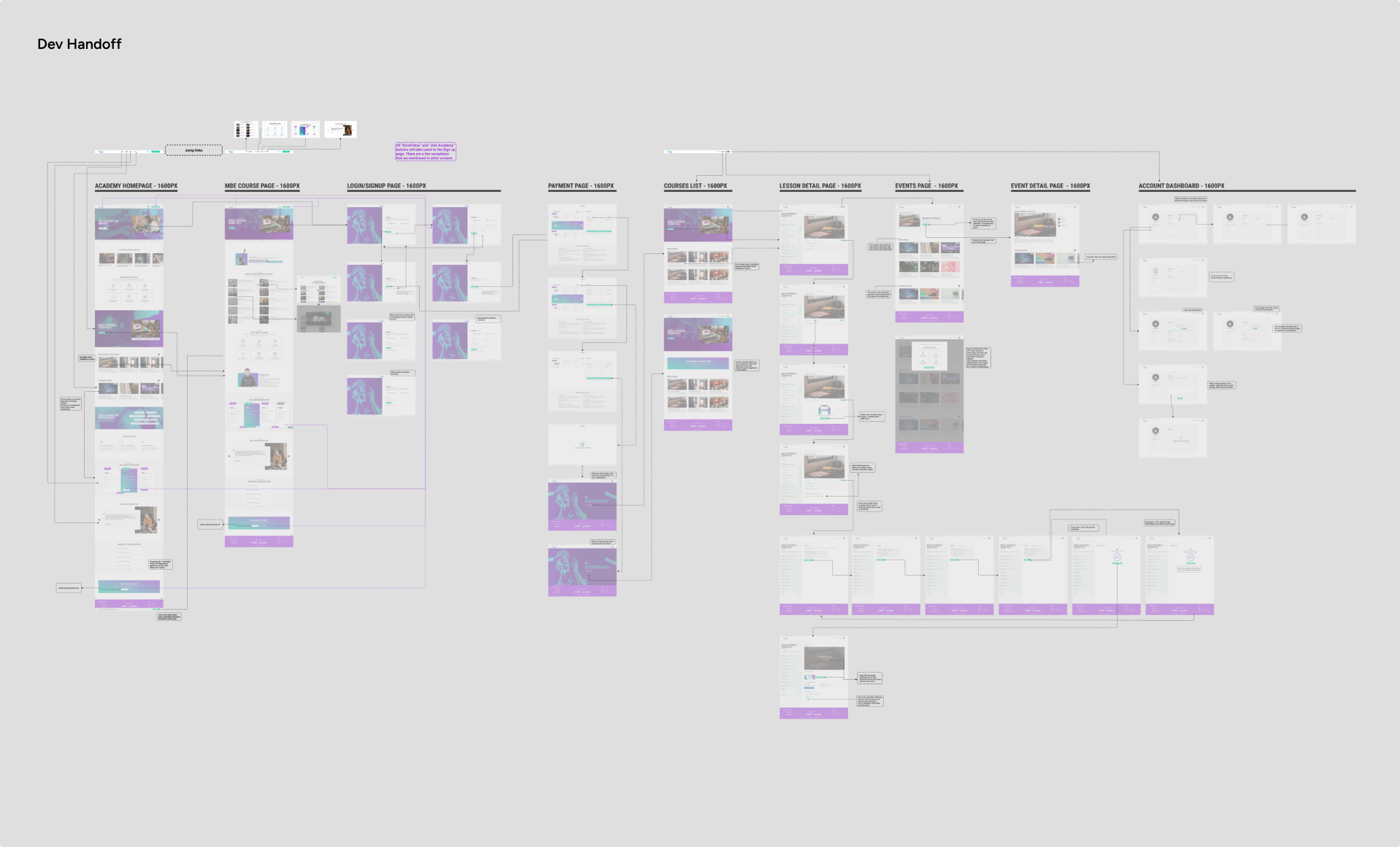
After finalizing the UI/UX design elements for Vampr’s Academy, the next critical phase was the design handoff to our development team. To ensure a seamless transition and clear communication, I took the initiative to create a comprehensive flowchart. This flowchart mapped out the entire user journey, from landing on the platform to navigating through various educational modules.
But I didn’t stop there. To give the developers a tangible feel of the user experience, I also developed an interactive prototype. This prototype simulated the entire browsing experience, allowing the devs to understand not just the look but also the functionality of Vampr Academy. This approach significantly reduced ambiguities and set the stage for a smooth development process.
Design QA
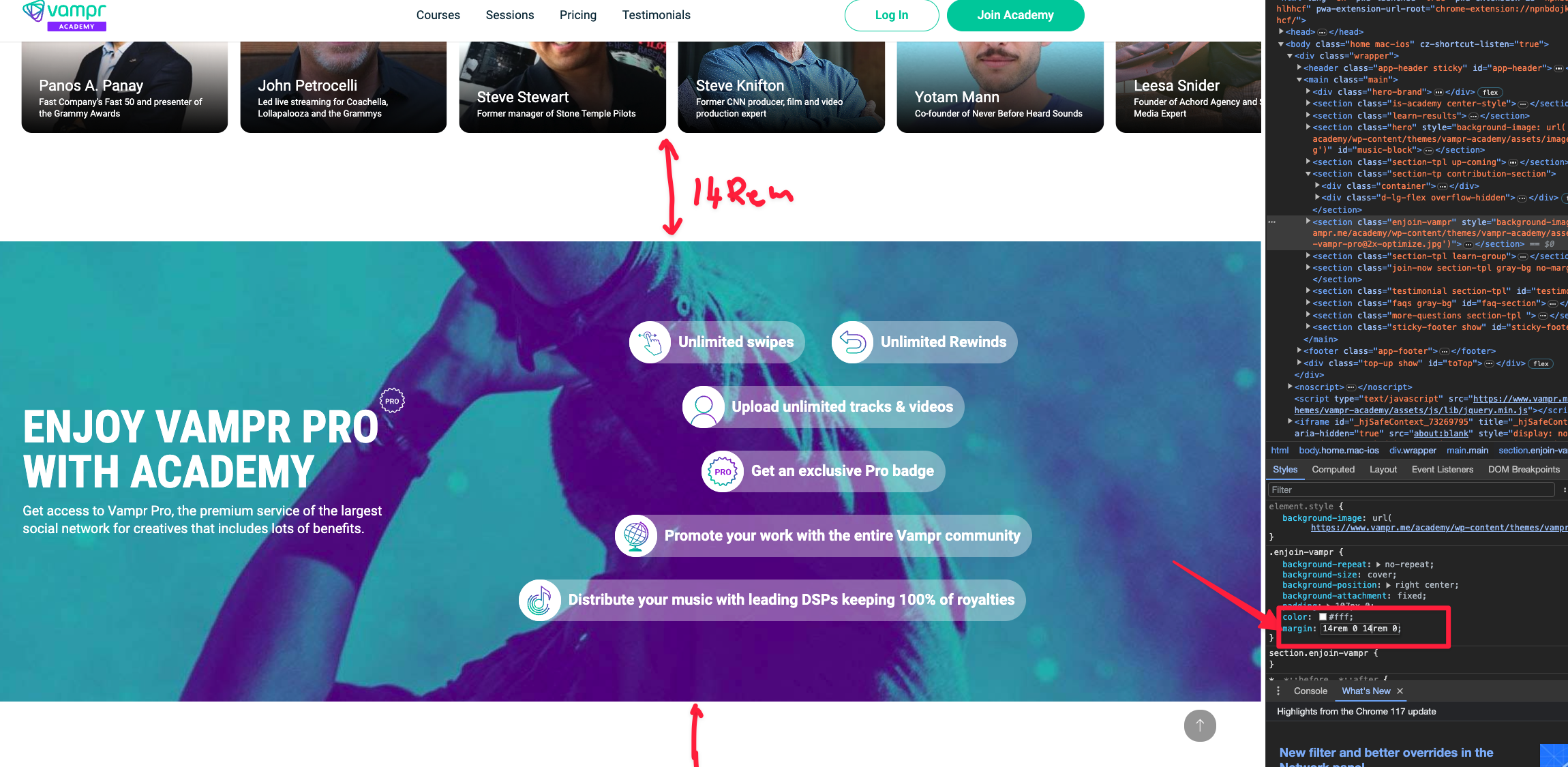
Having experience in HTML/CSS, I use this knowledge in my design QA process. I go directly to inspect the code myself and share my findings with the developers. This approach saves me a lot of time on explanations and back-and-forth discussions, ensuring the design is both accurate and pixel-perfect.
Additionally, we use a specialized tool, Superflow (usesuperflow.com), for commenting and collaborating directly on websites. This tool helps us gather feedback in one central location, with the aim of speeding up website development.
Outcomes
The overhaul of our web experience had a transformative impact on key business metrics. First and foremost, the redesign elevated our website’s credibility, positioning it as a trusted resource in the industry. This wasn’t just a superficial change; it led to a remarkable 10% increase in organic traffic and 5% growth in new user acquisition.
But the crowning achievement came in less than a year: the redesign played a pivotal role in catching the eye of Jaxsta, leading to a high-profile acquisition.
