2022- 2023
Tools
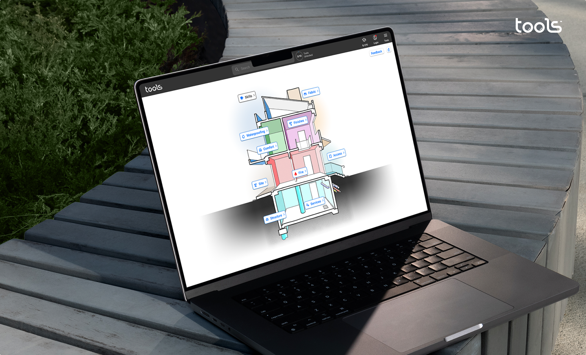
Tools is SaaS solution that helps prevent costly mistakes and maximise efficiency by transforming the National Construction Codes (NCC) into interactive, easy-to-understand graphics and where appropriate incorporating deemed to comply and best practice information.
Team
Founder
Product Manager
Product designer (Me)
CTO & Engineering team (2 Devs)
Role
👨🏻💻 Product (UIUX) Design
🎨 Branding & Marketing Design
Challenge
Jerry, the founder of Tools, with over 40 years of experience as a building inspector, came up with a one-of-a-kind SaaS design. His solution tackled a major problem that costs countries a whopping $20 billion annually. However, the implementation of the design lacked user-friendliness.
My role was to revamp Tools completely and enhance the current design. The big challenge was that Tools’ user base includes a majority of people who may not be particularly tech-savvy.
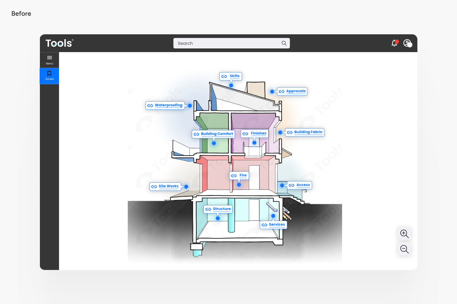
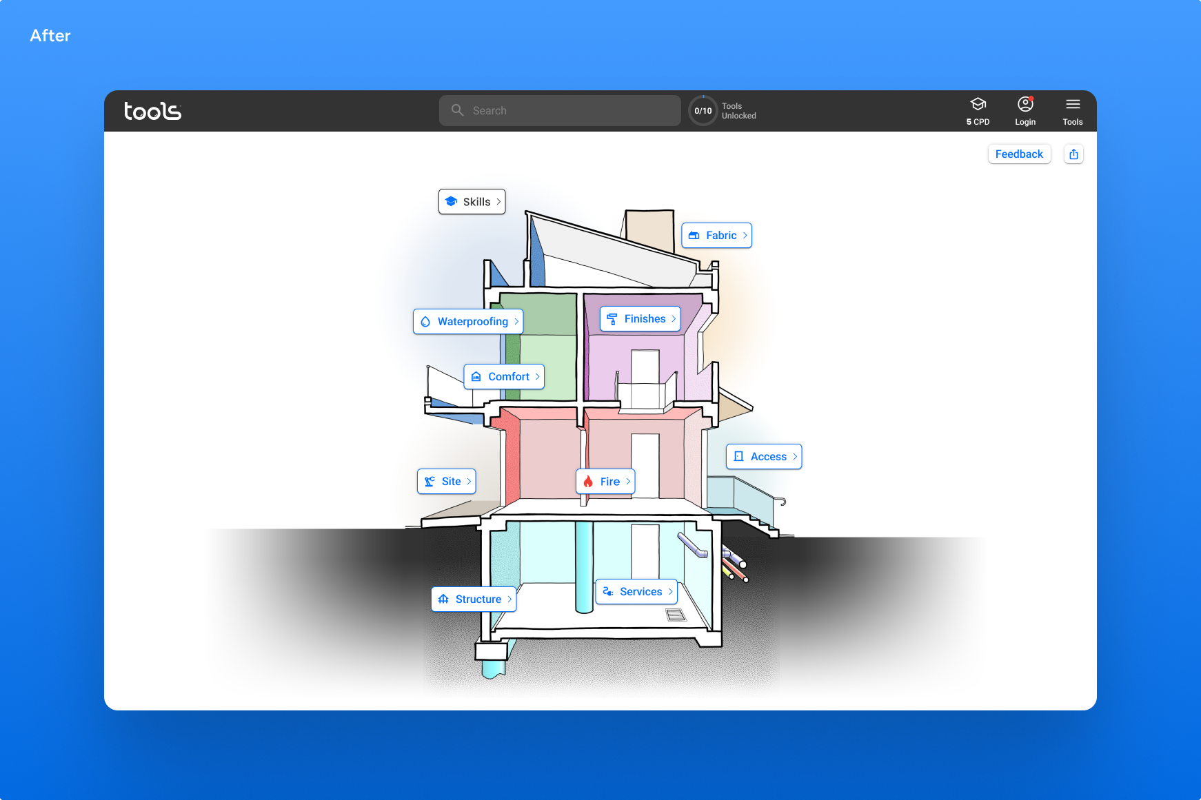
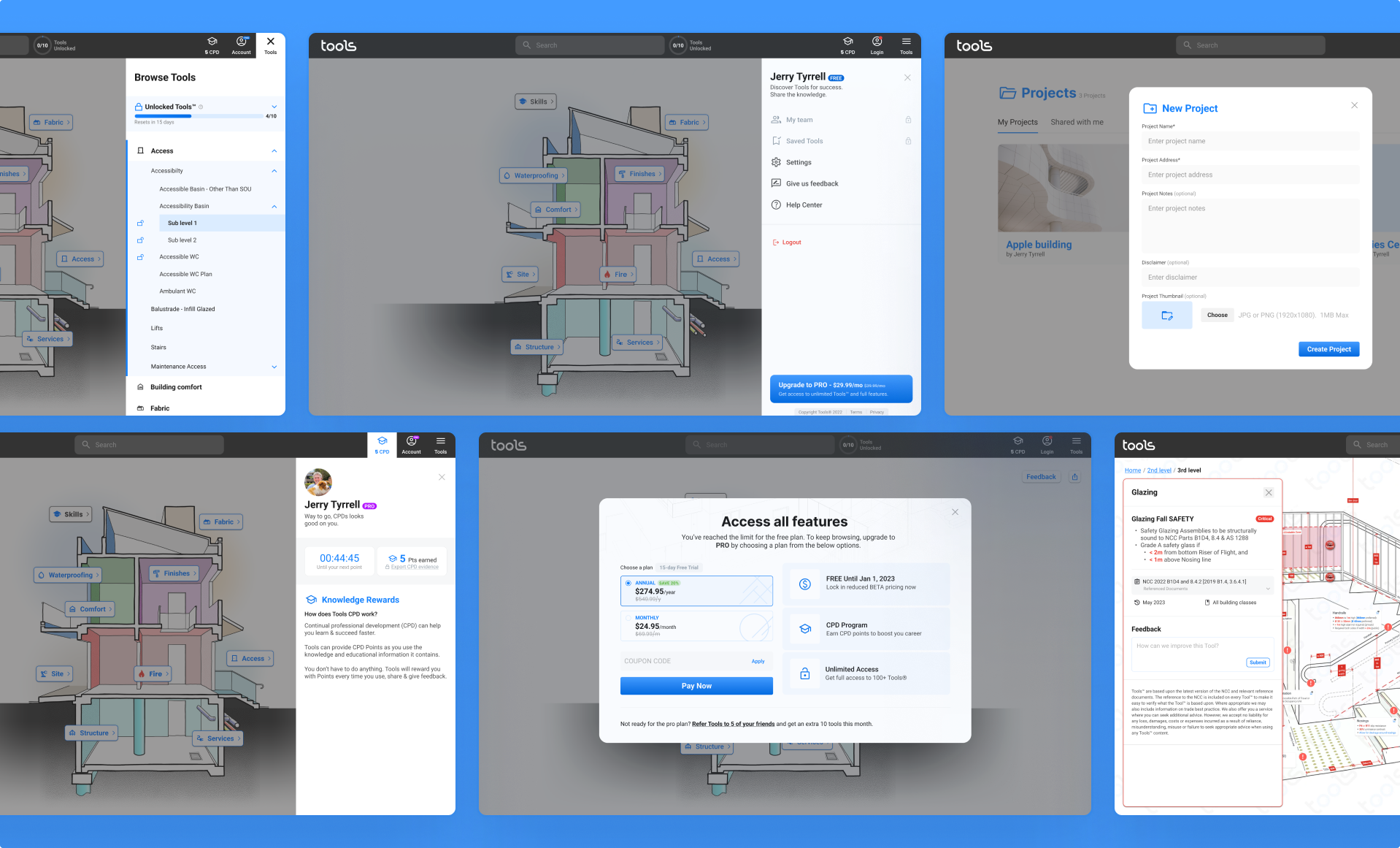
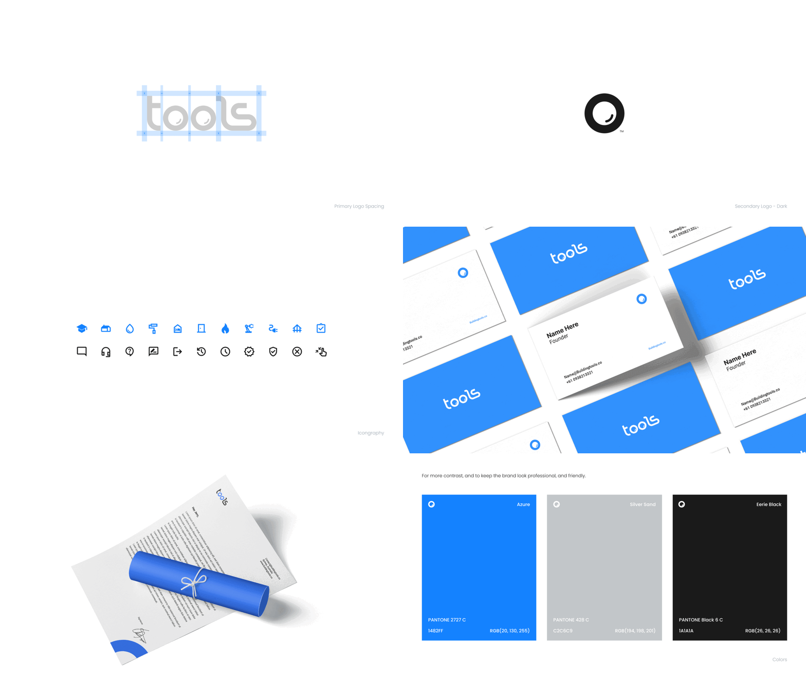
During the project’s early stages, I teamed up closely with both the Project Manager and the Founder. Together, we conducted several discovery sessions to shape the fresh design direction, and I had the opportunity to craft a forward-looking and innovative brand identity that truly represented our project’s core.
Later on, I had a chance to assess the current design, which unfortunately appeared a bit outdated and lacked consistency. It included a mix of different button styles, shadow effects, and components.
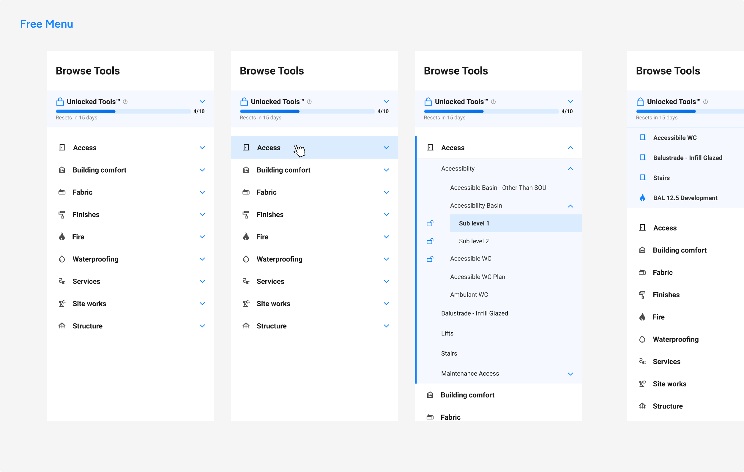
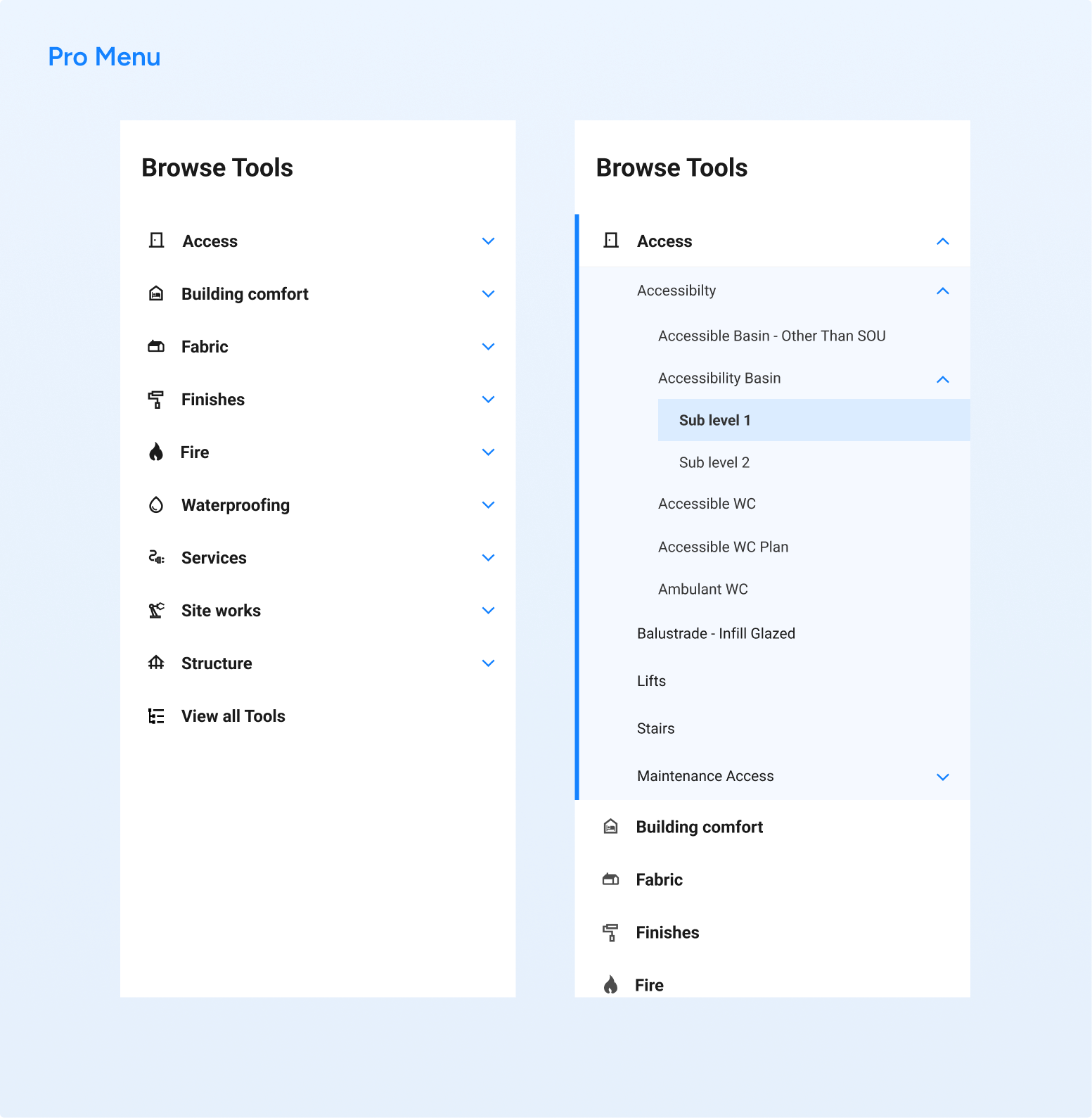
One of the exciting challenges I encountered was revamping the Tools menu, a mega menu bursting with numerous categories, subcategories, and even sub-sub categories.
Initially, the menu’s hierarchy was quite weak, making it challenging to distinguish between main categories, subs, and even sub-subs. It had the potential to become confusing, leaving users unsure of their current level within the menu.
Drawing inspiration from Gmail’s menu and after numerous brainstorming sessions, I opted for a similar approach. My goal was to enhance the hierarchy and create clear contrasts, ensuring that all users, regardless of their visual abilities, could easily navigate and find what they needed.
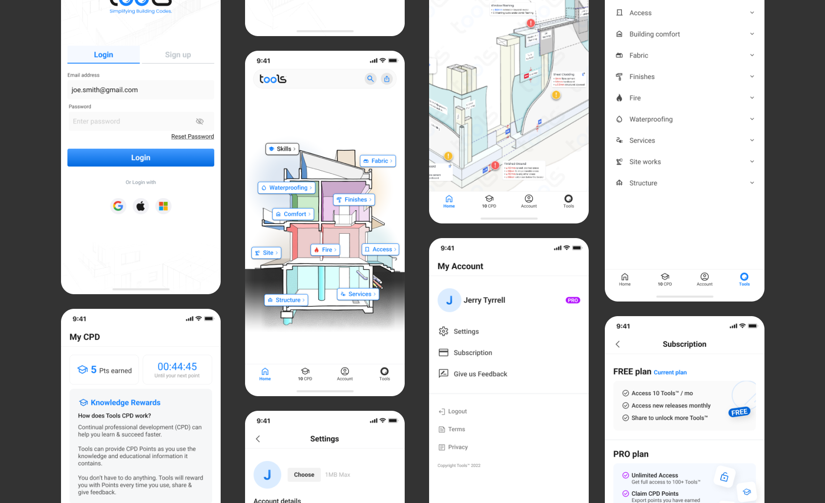
In the later phase, our Tools team had a major presentation. We were online on desktop only, and since we knew that our audience predominantly uses mobile devices in the construction field, we had to develop a light version mobile app of our SaaS solution in under a week.
Despite the challenging timeframe, I was fortunate to have all the elements configured with automatic layout, which turned out to be immensely beneficial in rapidly ensuring their adaptability and compliance with both iOS and Android standards.
In the same week, we needed to revamp the outdated landing page and unveil a fresh, user-friendly version to attract users and effectively introduce our product.
During that period, I collaborated closely with the engineering team, sharing design updates and conducting extensive quality assurance to ensure everyone on the team was content with the progress.
Outcomes
In summary, our teamwork on tasks like revamping our SaaS, redesigning the landing page, and refining our branding, along with our sales efforts, has made a significant impact. In just six months, we’ve managed to grow our user base from 200 to over 1000, all without the need for any advertising.
It’s been incredibly rewarding to be part of this journey, working on something truly special and remarkable. The results have been so impressive that the product practically markets itself.
I’m genuinely thrilled to have played a role in this project and can’t wait to witness the bright future that awaits this amazing product.
