2022 – Design Assignment/Concept Project
Strava
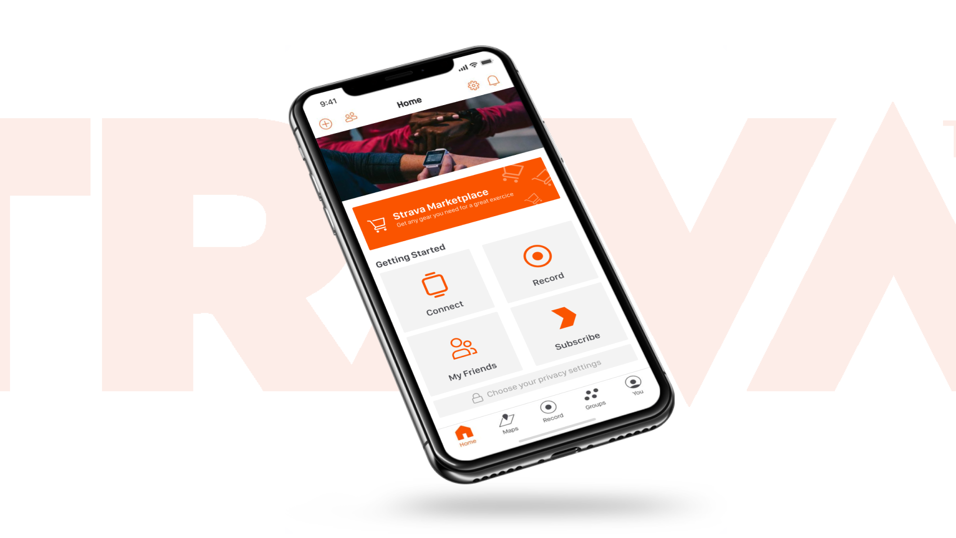
Strava is a platform for athletes and exercise enthusiasts to track their exercise and physical performance, particularly geared towards runners and cyclists. It incorporates social networking features by allowing users to publicly share their stats, routes and photos, connect with other users and form groups and clubs.

Strava monetizes their app via a premium subscription model, offering power users additional functionality, but they’re evaluating new revenue streams to hit ambitious revenue goals in 2022. After doing competitive benchmarking and user research, the chosen idea is to create a marketplace where users can buy and sell products (e.g. cycling gear). Strava would take a commission from each transaction.


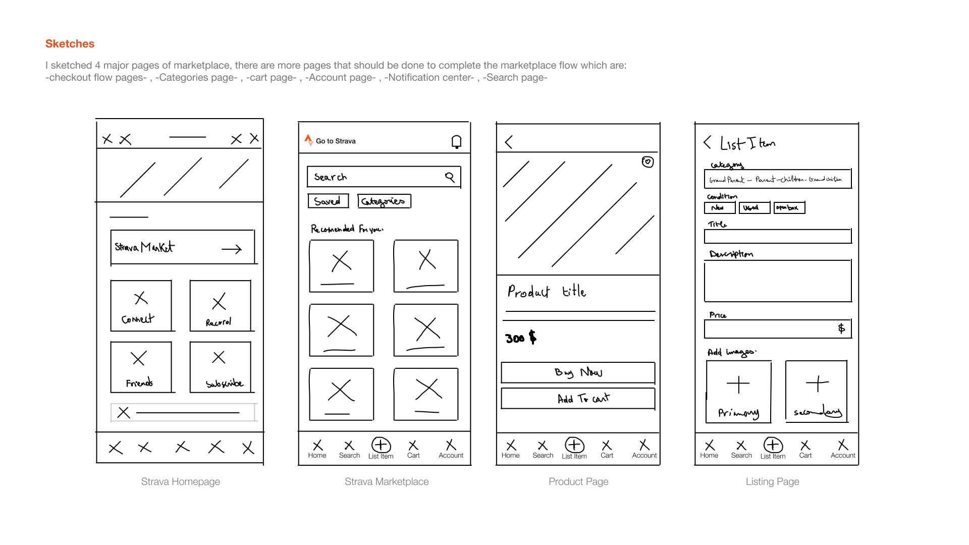
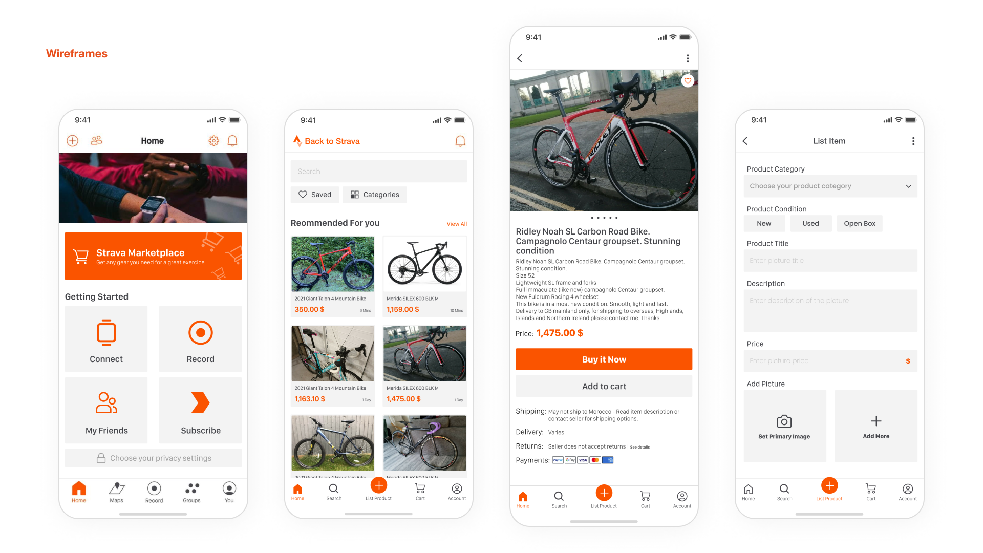
My main difficulty was figuring out how to introduce a significant new aspect to the application without causing any confusion for the users due to these new alterations. After careful consideration, I’ve chosen to proceed with Design Solution 2+3 because it appears to be the most suitable approach for maintaining the existing design pattern, which our users are already accustomed to.
Proposed Solution:
1. The marketplace functionality will resemble what is commonly done on marketplaces like eBay, a model that many Strava users are already familiar with.
2. We can implement a commission system for listing items.


In a nutshell, addressing this intricate UX challenge has proven to be both an engaging and demanding task. However, it is essential to note that there is significant potential for further improvements, which can be unlocked through a more profound exploration of user insights and preferences.
Reflecting on my journey, it was two years ago when I joined Vampr as a product designer, a pivotal moment that set the course for my involvement in their remarkable evolution.
