2020- 2022
Q8Rider
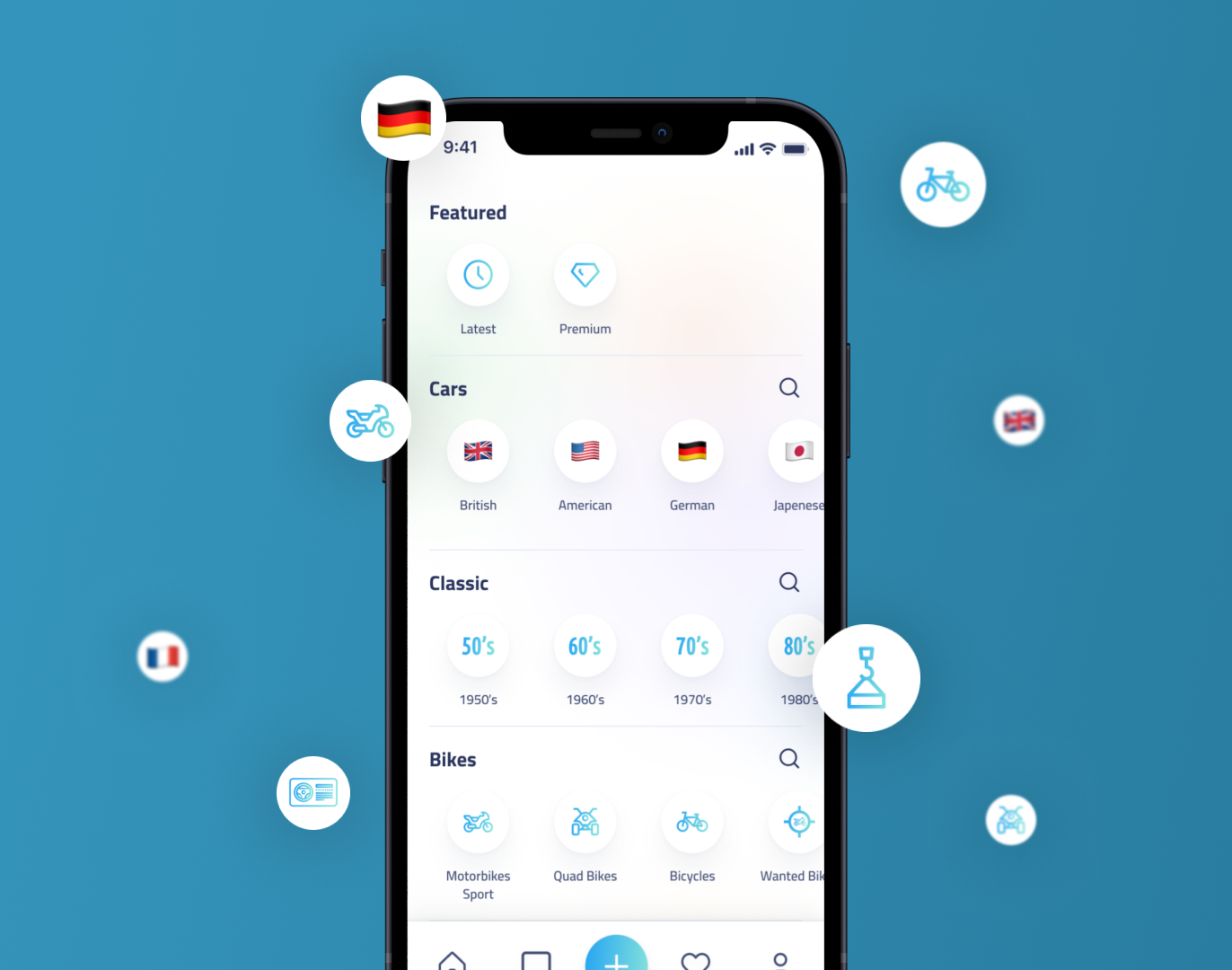
Q8RIDER, a Kuwait-based Mobile/Web App, made its debut in 2015 initially as a website before introducing the mobile application. Q8RIDER serves as a platform for selling various items. Users have the option to list their items for sale by paying a posting fee through the Knet payment gateway. Additionally, Q8RIDER offers an exciting auction game feature.
Team
Founder
Project Manager (Me)
Product designer (Me)
Engineering team (4 Devs)
Role
👨🏻💻 Product (UIUX) Design
🎨 Branding & Marketing Design
📂 Project Management

This project spanned approximately half a year, give or take, and underwent two significant revisions. The initial one could be considered less successful, yet it proved invaluable in identifying shortcomings in the prior version and pinpointing areas of difficulty for our target audience. In our initial attempt, we concentrated primarily on enhancing the user interface without considering the user experience aspect. The subsequent iteration enabled us to shift our perspective and make it more straightforward for users to grasp the value of Q8Rider’s service.


In the second version of our project, we really dove deep into it! We kicked things off by tackling the user flow, which was a bit of a challenge because our app is quite extensive with numerous categories, sub-categories, and even sub-sub-categories (it’s like a family tree of features). Initially, it seemed a bit daunting, but with the help of our client, we managed to simplify it and make it more user-friendly, especially for folks over the age of 25.
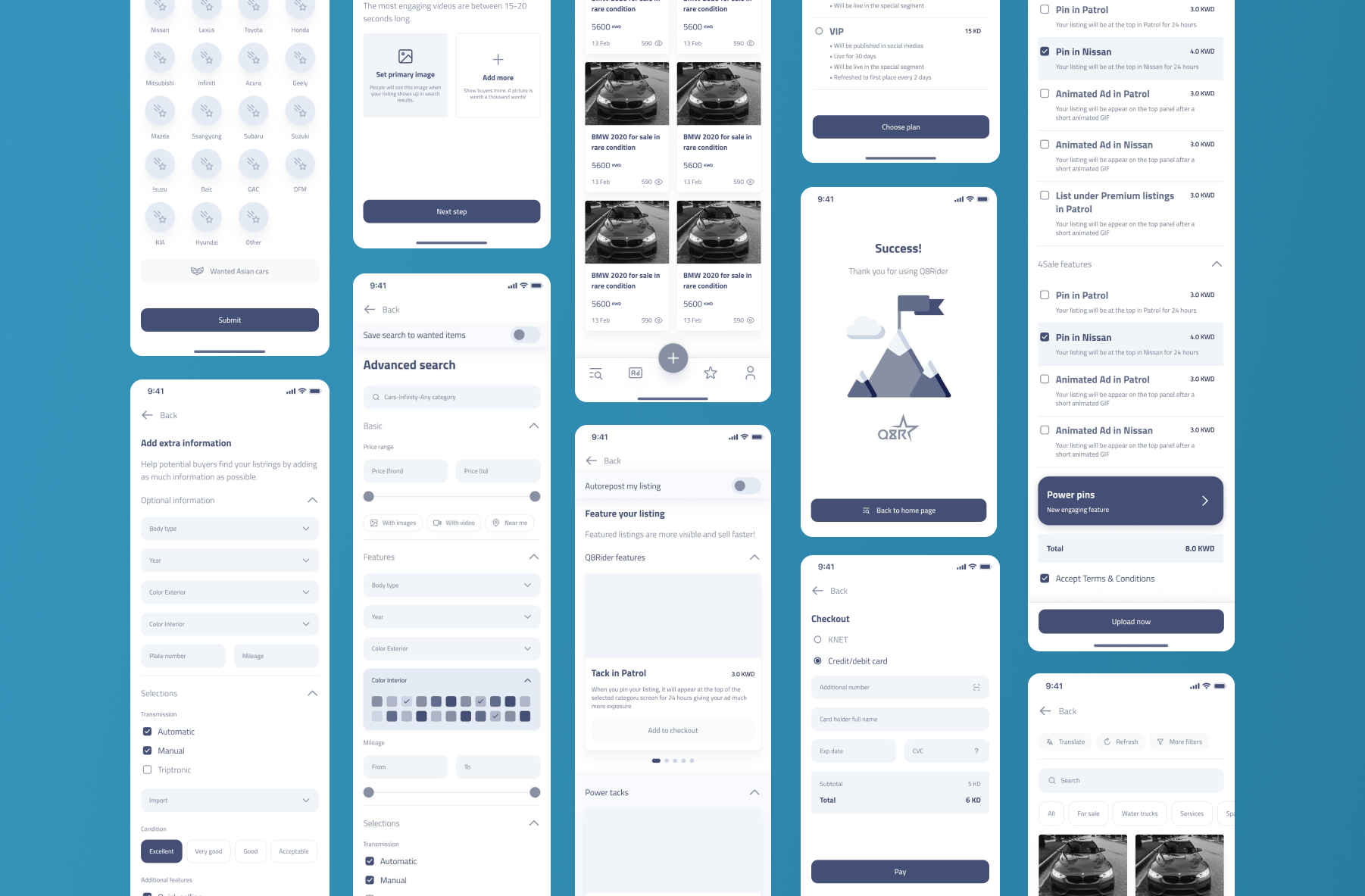
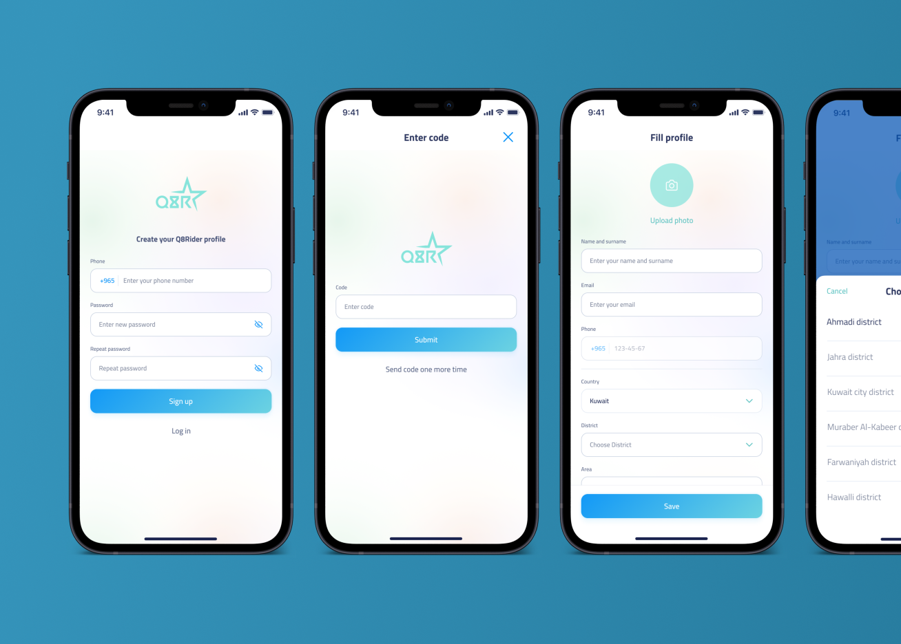
As we progressed, my role shifted to handling the UI aspect. I began by sketching out the app’s pages, and once those designs received the green light, I moved on to creating low-fidelity wireframes. That phase took us about 2-2.5 months. Once those wireframes were approved, we finally delved into crafting the high-fidelity wireframes and visual design. This involved adding images, icons, colors, and all the branding elements that make an app visually appealing.
Towards the end of the project, I put together a prototype of the app for testing, and it turned out to be pretty awesome! Of course, we did make some minor adjustments based on the valuable feedback we received during usability testing, but overall, it was a satisfying journey.


Outcomes
In brief, the app’s growth has been consistent since we introduced the new design, and our board members are actively pursuing investors. While we’ve taken a brief break from working on improvements, there’s a lot of room for exciting enhancements and features in the near future!

