iFirstaid is a Mobile App created by SURVIVAL, a prominent player in the field of first aid kits. They approached me with the task of revamping their previous app and website, which had considerable potential for enhancement and refinement.
Role
Lead Product (UIUX) Design Branding & Marketing Design Project Management
Team
Founder Product Owner UX Researcher Lead Designer (Me) Illustrator
Challenge
Our task was to completely overhaul a product that delivers crucial information to users in highly critical life situations. Our goal was to ensure it was not only extremely secure but also incredibly user-friendly for individuals of all ages.
In contrast to competitors who present information in plain text, we boldly chose to adopt a demanding approach, combining straightforward instructions with vivid illustrations, adhering to the principle that a single image can convey the meaning of a thousand words.
Goals
→ Provide first aid information at fingertips to save lives by improving the UX & UI → To be the best universal digital advisor for first aid
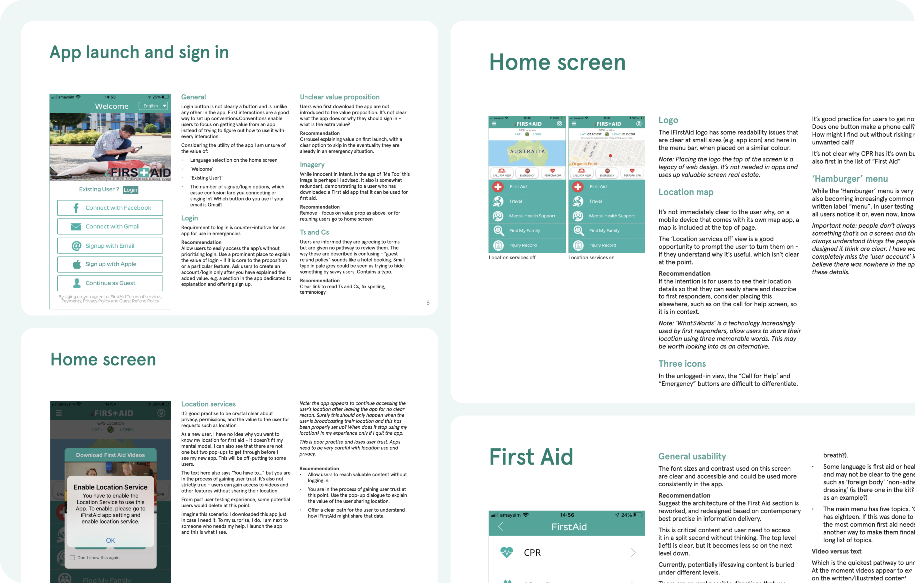
Heuristic Review
Before delving into design, I independently conducted a comprehensive design audit, scrutinizing every screen of the application to pinpoint improvement possibilities. I collaborated closely with the Product Owner (PO) who performed his heuristic review, and together we merged our findings to develop improved solutions.
To validate these enhancements, we conducted usability tests with users on our interviews sessions, and interestingly, our suggestions closely aligned with the feedback we received from the tests.
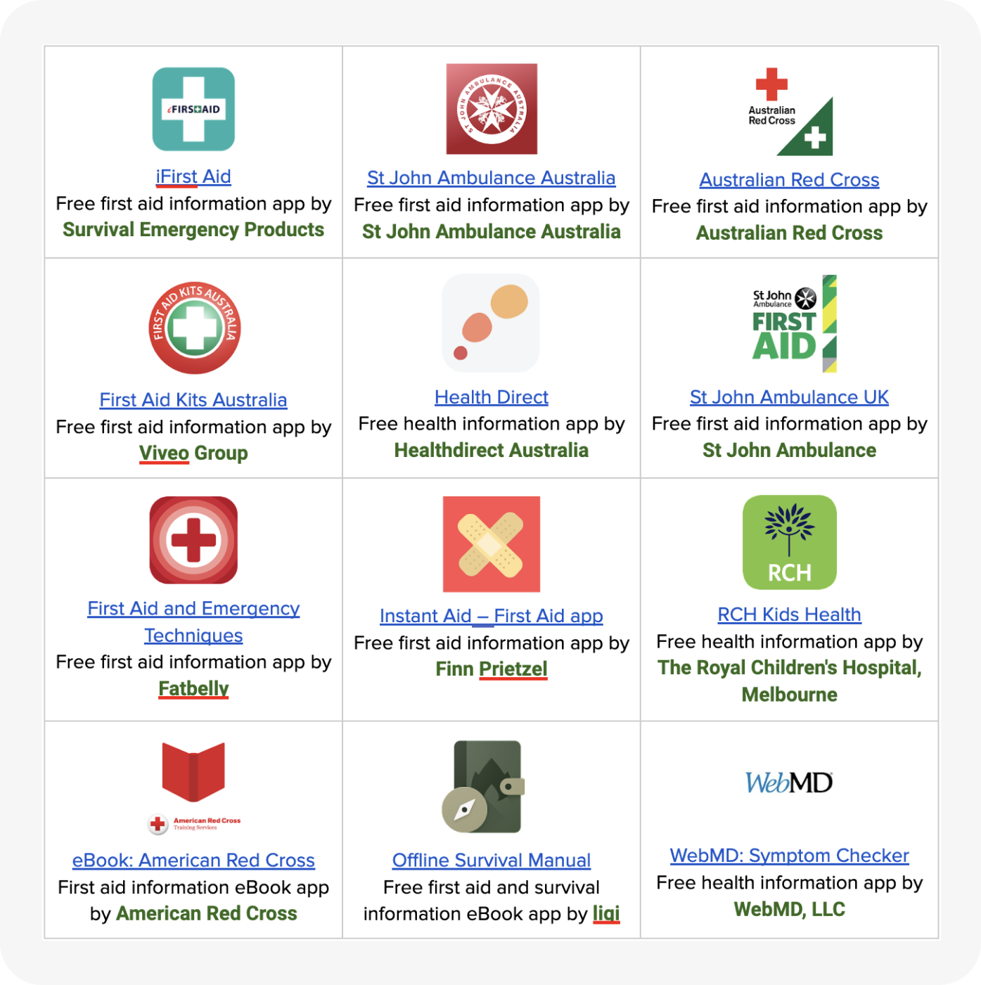
A study on competing apps with a focus on understanding their features, and the most effective ways of communication.
Our Goal is to provide excellence in first aid content instruction and learning.
To achieve this we reviewed apps to ascertain how we compare and what we need to change. The apps were reviewed via android mobile phone so may display differently on other devices.
→Empowering Learning: Facilitate first aid knowledge retention. →Efficient Location Sharing: Enable seamless, in-app location sharing. →Multilingual Accessibility: Support multiple languages for wider user reach. →Emergency Call Function: Ensure easy access to “call for help” in emergencies. →Intuitive Design: Prioritize simplicity for effortless user navigation. →Humanized Instructions: Enhance engagement with natural, friendly audio guidance.
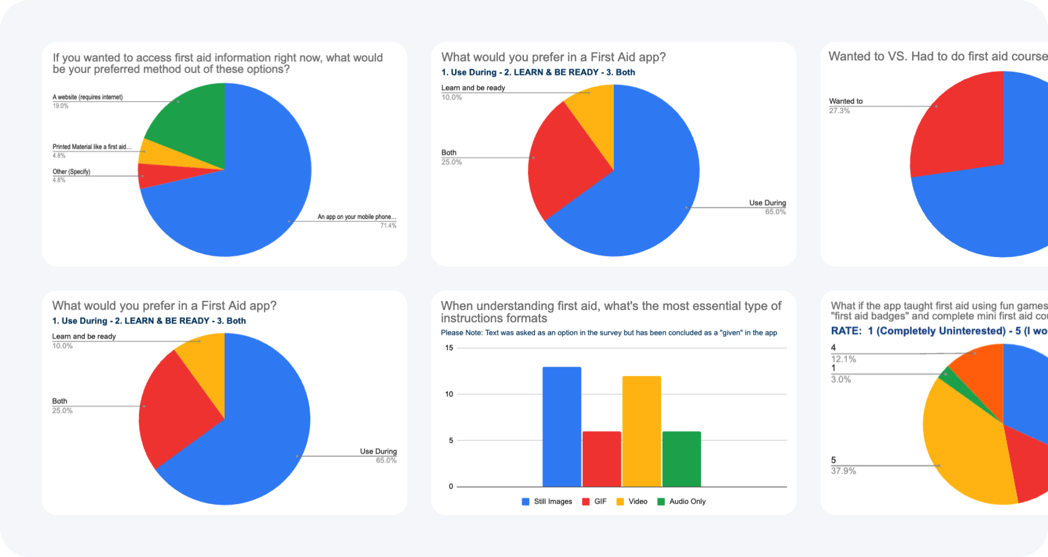
User Interviews
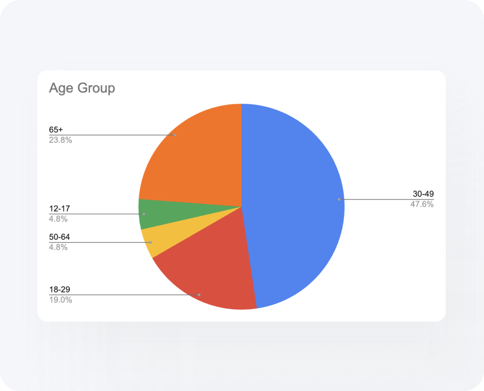
We conducted interviews with 20 individuals, employing both qualitative and quantitative methods, to explore their views on first aid, their actions in first aid scenarios, and their inclination to utilize a first aid application.
In terms of demographic diversity, we sought to engage individuals of varying ages and diverse backgrounds, as first aid is applicable to a wide range of people and not limited to a particular audience.
We ensured a comprehensive understanding of user concerns by posing a combination of open-ended and closed-ended inquiries, categorizing their responses into three primary areas: 1. Use during an emergency 2. Content 3. Learning and Preparedness
→ 67% of people said it was essential to have access to first aid instruction, 33% said it was nice to have, and 0% said access to first aid instructions was dispensable.
→ 71% preferred accessing first aid information via an app that can be used offline.
→ 81% showed strong interest in having access to an app that improved first aid knowledge
→ 90% of people said they would ACT FIRST in an emergency vs. looking up first aid instructions.
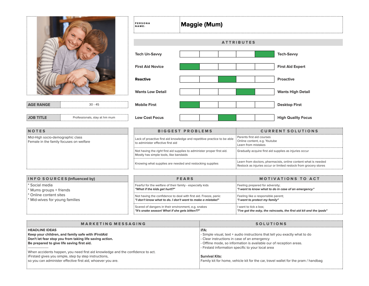
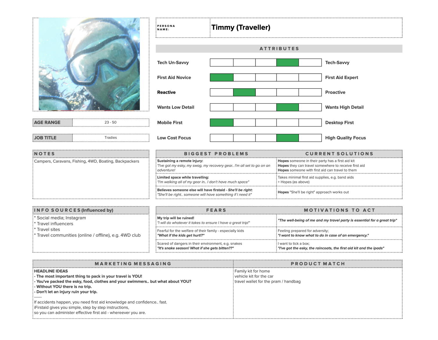
User Personas
A definition of 3 core user segments which explores their problems, fears, motivations, and potential marketing messages.
From the conversations we had, we spotted three common personas that represent the shared experiences and needs of all our interviewees. This way, we can understand and connect with our users on a more personal level!
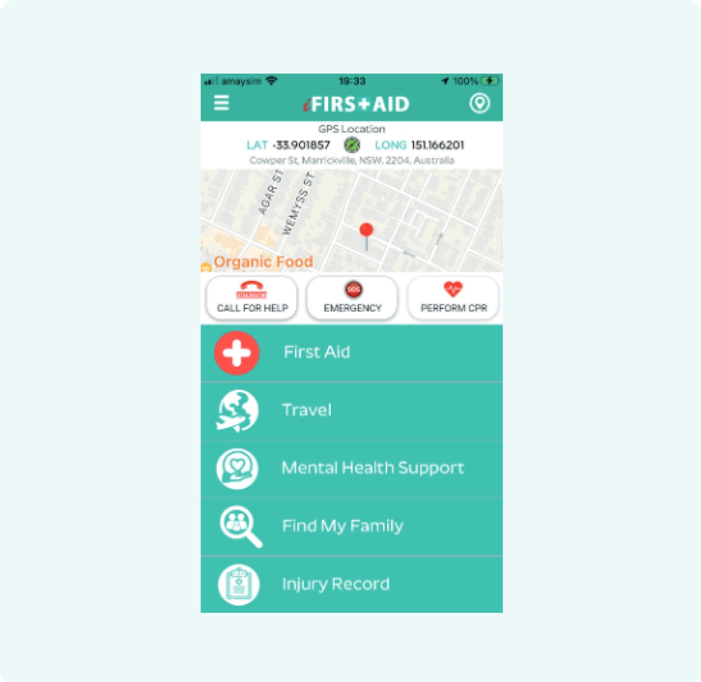
The old user flow had quite a few steps and was tricky to get through. Before folks could even get to the first aid info, they had to log in and turn on location settings. This design wasn’t really helpful for people in emergencies who needed help quickly. The extra steps could slow things down at a time when every second counts. The design didn’t meet the need for quick, easy access to help, showing that there’s room to simplify the process to better assist folks in urgent situations.
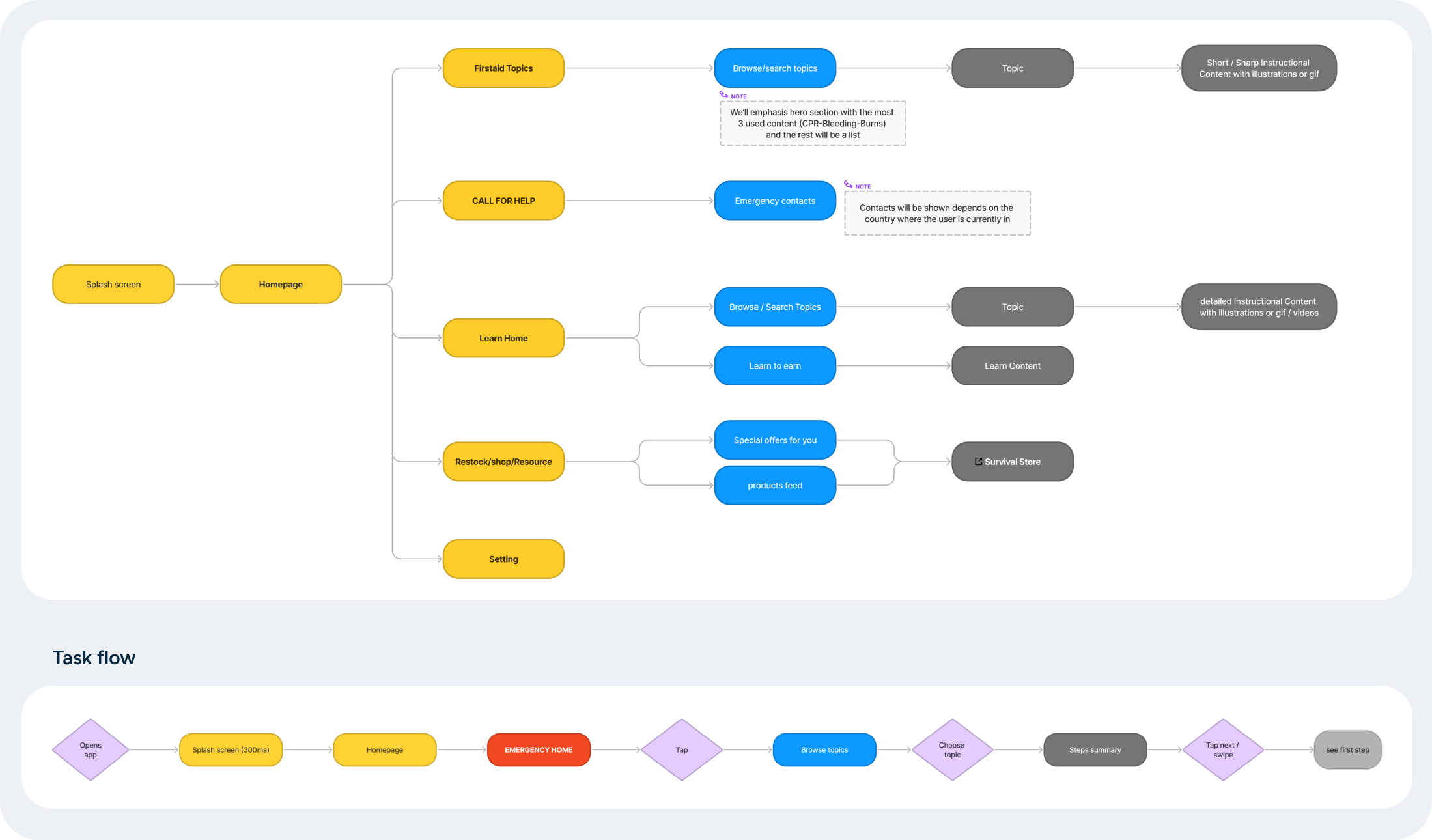
New User Flow
In my proposal, I honed in on refining the flow to provide immediate assistance to users during critical situations. By simplifying the journey, I’ve ensured that access to first aid instructions is rapid and straightforward, removing any navigational hurdles. I did away with all the sections that didn’t directly contribute to the app’s primary objective. This way, users won’t have to face any additional steps such as logging in or enabling location settings, which were previously seen as barriers, especially in emergency scenarios. The newly proposed design is all about bringing essential first aid information to the users’ fingertips with minimal fuss, making the app a reliable companion in times of urgent need.
Low-fidelity Wireframes
Our main goal was to provide users with swift assistance. With this in mind, I’ve restructured the topics page to welcome users as soon as they launch the app. Moreover, I’ve added a “call for help” button that’s always within reach, ensuring users can call for aid whenever needed. Lastly, the homepage now highlights the most vital topics, tailored to user preferences, making it easier for them to find the crucial information they seek without delay.
Rebrand
I collaborated closely with a friend who spearheaded the rebranding while I provided direction and guidance throughout the entire process. After engaging in brand strategy discussions with the Founder and Product Owner, we organized internal sessions. During these sessions, we presented mood boards and brainstormed logo concepts, eventually arriving at a final proposal that won the whole team over.
We aimed for a blend of an iconic logo and a wordmark, keeping in mind the business’s existing first aid products. This approach granted us the flexibility to utilize either logo variant, ensuring a fitting representation in diverse scenarios.
High-Fidelity Wireframes
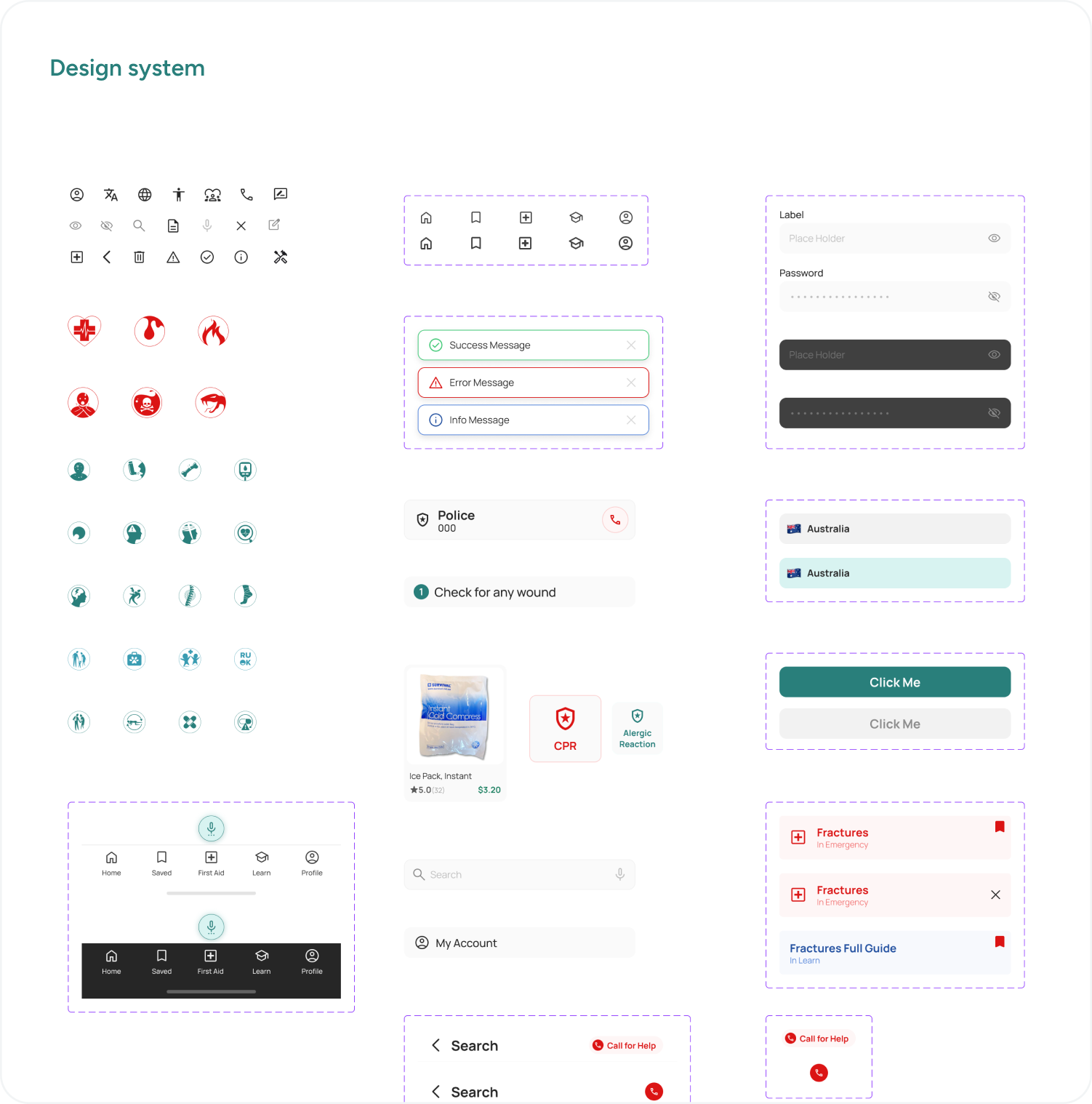
While crafting the final product, the extensive rebranding led us to develop a style guide encompassing colors, typography, and icons. I ensured that the app’s design remained consistent across all pages, reflecting our refined brand identity.
The landing page, in particular, required a redesign to align with the new branding. This step was crucial to maintain a coherent and appealing visual identity throughout, ensuring a seamless transition between the landing page and other sections of the app.
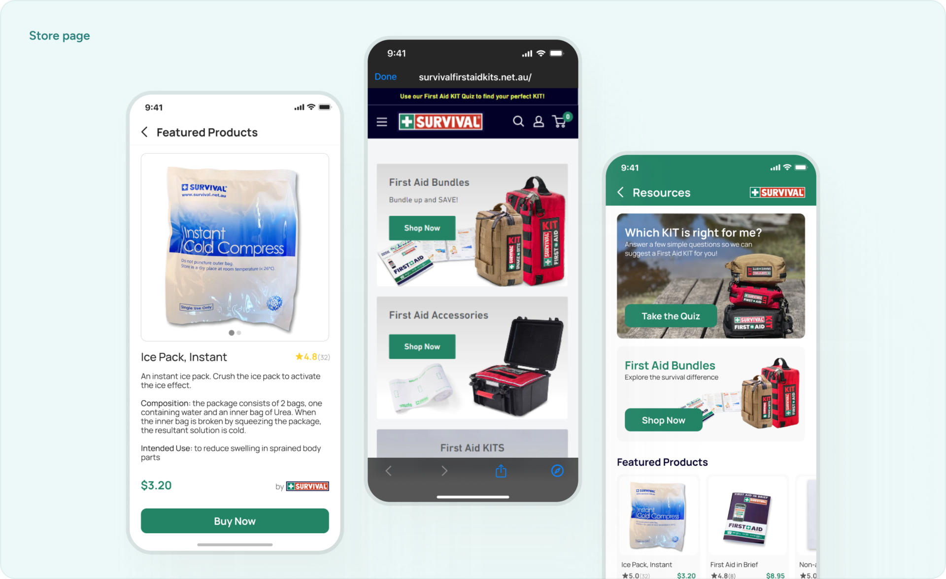
“We should convey that we’re here to help, not to sell first aid.”
We faced a bit of a challenge when we wanted to incorporate the SURVIVAL store into our app. However, we didn’t want it to distract from our primary mission of “assisting people in critical life situations at no cost.”
Therefore, we made sure not to emphasize the store in the app’s instructions. Instead, we made it an optional section that users can explore if they find it helpful.
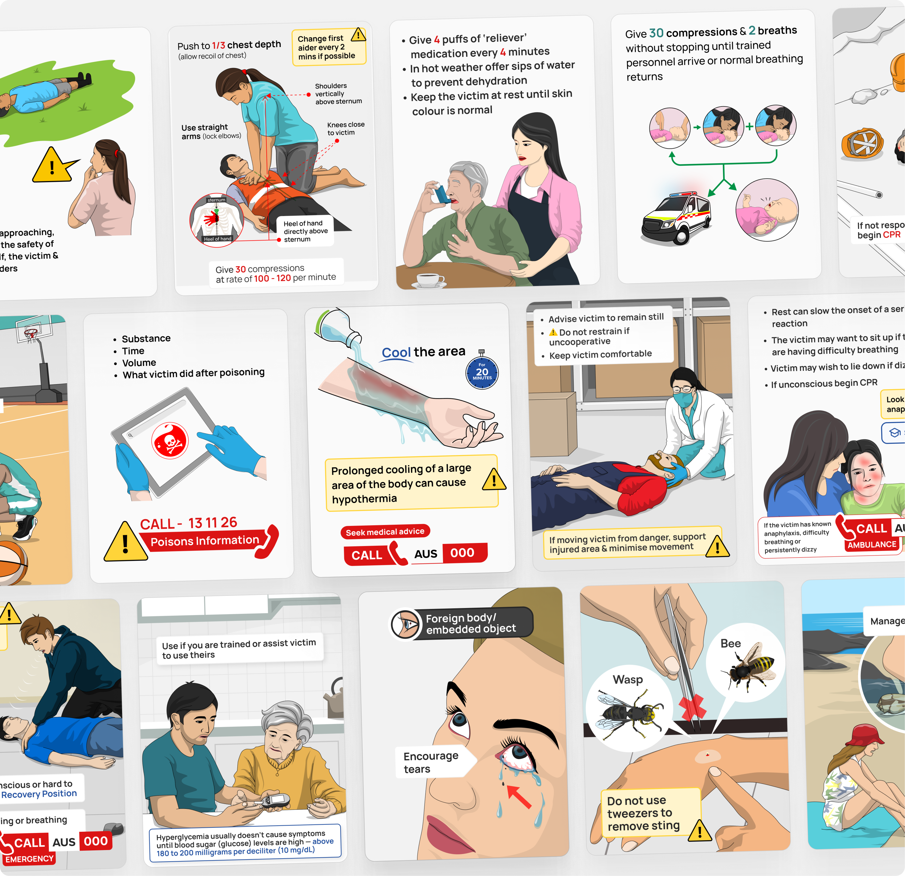
First Aid Illustrations
One challenging aspect I encountered was managing the illustrations. Why so? Collaborating with an illustrator from a different country, whose English was quite basic, posed a communication hurdle. Despite the language barrier, the illustrator was immensely talented, which warranted patience to achieve the desired outcomes showcased below.
To navigate this challenge, I established daily check-in points with the illustrator, providing clear and constructive feedback. I simplified our communication by creating doodles and rough sketches to visually convey my ideas, ensuring a better understanding of the envisioned design. This iterative process continued for over three weeks, gradually fine-tuning our direction. Eventually, we arrived at a concept that resonated with our initial objectives, garnering approval from both myself and the founder.
Outcomes
In closing, the refresh of the iFirstaid app led to a great 30% jump in downloads, putting SURVIVAL at the front in the market and lifting iFirstaid into the top list of first aid apps. What’s coming up? We’re getting ready to bring in a new learning area where users can learn more about first aid. We’re also adding more helpful features like having the app in different languages, a dark mode for easier viewing, and options to change font size and colors for those who are colorblind. Together, we’re moving forward on our big goal: to make life-saving skills easy to get to for even more people! 📱🩹🚀